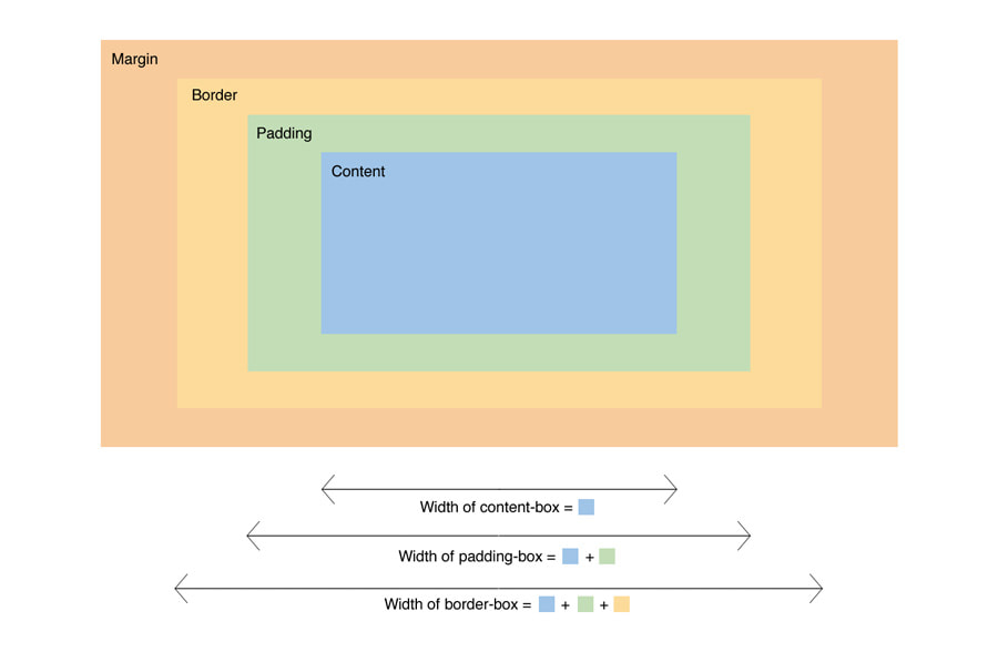
The CSS “box model” is confusing. Mainly because an element’s width is the width of the element plus its padding-width and border-width. Setting your element’s width to 100% and assigning 20px padding actually results in a width of 100% + 40px. That’s not only confusing, but it’s difficult to work with. Instead, you can simplify the CSS box model using the box-sizing property.
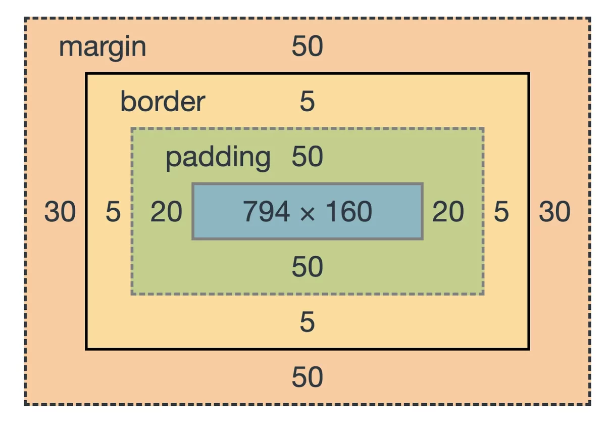
Here’s an idea of how CSS box model works. The “width” of this element is 794px, but the actual width is 794px + 5px + 20px + 20px + 5px (totaling 844px) which results in you doing math and a convoluted way of keeping track of numbers while you’re developing your website’s styling.

Changing box-sizing from content-box to border-box makes everything simpler and easier to work with.
Here’s an example to implement box-sizing border-box using Sass:
html {
  box-sizing: border-box;
}

* {
  &,
  &:before,
  &:after {
    box-sizing: inherit;
  }
}
See how easy that is?
Get every element on the page using box-sizing border-box with just a few lines of CSS (or Sass, as used in the example).
This way, when you apply border-width and padding to an element the additional width is included in the element’s width — so, width: 100%; is truly 100% of the available width and your border and padding widths are accounted for inside of that space instead of as additional pixels.
For further discussion, check out the comments on this post from CSS-Tricks dating back to 2014.


0 Comments