The 60/30/10 Color Rule for Website Design UI

by | April 30, 2023 | Website Design

This page may contain affiliate links to recommended products or services. If you choose to purchase after clicking a link, I may receive a commission at no additional cost to you.

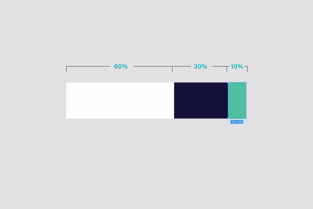
The 60/30/10 color rule for website design and user interfaces is awesome. Essentially, 60% of your web page’s user interface should be a base color, 30% should be an accent color, and 10% should be your highlight color. Following this guideline, you can create graphical user interfaces (GUIs) that are easier to read, more intuitive to use, and actively draw people’s attention to the important parts of the page like call-to-action buttons and promotional notifications.

Apply the 60-30-10 color rule to your website and the result is a better looking design, by design.

Of course, you still have to pick complementary colors. But, there are plenty of free tools to help you generate color palettes.
Floyd Hartford is a website developer from southern Maine. He's focused on creating and building WordPress websites and loves spending time digging into code like HTML, CSS, scss, jQuery, PHP, and MySQL.

0 Comments

Submit a Comment

Your email address will not be published. Required fields are marked *

four − one =

This site is protected by reCAPTCHA and the Google Privacy Policy and Terms of Service apply.

Looking for WordPress Help?

I’m a freelance web developer specializing in small business and corporate marketing websites.

Pin It on Pinterest