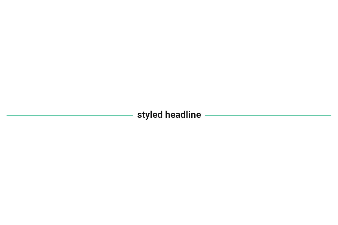
A noticeable trend in website design is styling text headers with a vertically centered background line. Sometimes, the text is centered and the background line extends out from both sides. Sometimes, the text is left-aligned and the background fills the rest of the screen. And on rarer occasions, the text is right-aligned and the background line extends to the left. Often, there is a gap between the text and the background line to create visual spacing. And occasionally, the text’s area will have a different background color than the page to give it a blocked-in effect. In this post, I’m going to show you how to use CSS to create the styled header with center line effect using a few different methods including flex-box and absolute positioning.
Demo
Example 1: Center-aligned headline with a center line background and blocked-in text effect.
Example 2: Center-aligned headline with a center line background on a solid color background.
Example 3: Left-aligned headline with a center line extending to the right and boxed-in text effect.
Example 4: Center-aligned headline with a center line and boxed-in text effect.
Example 5: Right-aligned headline with a center line extending to the right and boxed-in text effect.
See the Pen Untitled by Floyd Hartford (@floyd) on CodePen.
Explanations
Example 1 Explained
/* Example 1 */
h1 {
  position: relative;
  text-align: center;
}

h1::before {
  position: absolute;
  z-index: 1;
  width: 100%;
  content: "";
  height: 1px;
  background: red;
  top: 50%;
  left: 0;
}

h1 span {
  position: relative;
  display: inline-block;
  background: #fff;
  z-index: 2;
  padding: 0 1em;
}
Example 1 uses an extra span within the H1 header element to create the boxed-in effect that gives the text’s area a different color background than the rest of its row. Using z-index and absolute positioning on the ::before pseudo-element you’re able to layer the text area on top of the vertically centered background line. On the plus side, this is probably the most flexible way to create the effect, however, it does require using an additional span element.
Example 2 Explained
/* Example 2 */
h1 {
  display: flex;
  flex-flow: row nowrap;
  text-align: center;
  align-items: center;
  column-gap: 1em;
  justify-content: space-between;
  white-space: nowrap;
}

h1::before,
h1::after {
  content: "";
  height: 1px;
  flex: 1 0 auto;
  background: green;
}
Example 2 uses CSS flex-box properties to position the ::before and ::after pseudo-elements. This technique is elegant, however, you’re limited to a single background color and therefore unable to apply the boxed-in text effect.
Examples 3, 4, and 5 Explained
/* Example 3 */
div#example-3 {
  position: relative;
}
div#example-3::before {
  display: block;
  content: "";
  width: 100%;
  height: 1px;
  background: orange;
  position: absolute;
  top: 50%;
}

h1 {
  position: relative;
  background: navy;
  color: #fff;
  display: inline-block;
  margin: 0 auto;
  padding: 8px 0.5em;
  line-height: 1;
  border-right: 0.5em solid #fff;
}

/* Example 4 */
div#example-4 {
  position: relative;
  text-align: center;
  background: #f8f8f8;
}

div#example-4::before {
  display: block;
  content: "";
  width: 100%;
  height: 1px;
  background: teal;
  position: absolute;
  top: 50%;
}

h1 {
  position: relative;
  background: navy;
  color: #fff;
  display: inline-block;
  margin: 0 auto;
  padding: 8px 0.5em;
  line-height: 1;
  border-right: 0.4em solid #f8f8f8;
  border-left: 0.4em solid #f8f8f8;
}

/* Example 5 */
div#example-5 {
  position: relative;
  text-align: right;
}

div#example-5::before {
  display: block;
  content: "";
  width: 100%;
  height: 1px;
  background: blue;
  position: absolute;
  top: 50%;
}

h1 {
  position: relative;
  background: navy;
  color: #fff;
  display: inline-block;
  padding: 8px 0.5em;
  line-height: 1;
  border-left: 0.5em solid #fff;
}
Examples 3, 4, and 5 assume the header is wrapped in a container div. It uses absolute positioned pseudo-elements to position the vertically centered background line and presents and opportunity to style the header element left, right, or center and with or without its own unique background color without adding an extra element.
Use Cases
Which technique you use to achieve the desired effect is entirely up to you. The deciding factor may come down to how your HTML is structured or how comfortable you feel altering it on your own if it differs from the examples. Sometimes, it’s easier to add an extra span within a header element than it is to style a container div. And sometimes, you won’t have a container div to work with. When all is said and done, each implementation is going to look how you want it too, so choose the technique that works best for your website.
Gutenberg Block
After writing this article, I decided to create a customizable Gutenberg block for an even simpler way of creating a header with center-line styling for WordPress website content. I’ve packaged the block as a WordPress plugin and made it available as a free download. Check out Fancy Headline Gutenberg Block WordPress Plugin for more info and a download link.


0 Comments