
In this article, let’s learn how to use CSS to embed responsive Google Maps on your website.
Out-of-the-box, Google Maps embeds come as fixed-sized iFrame HTML elements. That means there’s a defined height and width that doesn’t change. It’s really easy to copy+paste the embed code on your website, but it’s not going to resize for mobile browsers or different screen sizes, so it can cause a problem — especially since most modern websites are responsive to screen size. Non-responsive elements create poor user experiences and look bad, too. Like, why would you have everything on your website working perfectly except that map?
Using a little bit of CSS and HTML you can give an embedded Google Map a responsive appearance.
Styling the map itself is out of the question because it’s inside of an iframe. However, you can wrap the iframe in a container div and use CSS to style the container and the iframe itself — it’s pretty simple.
Adding a Google Map to Your Website
Choose a Map
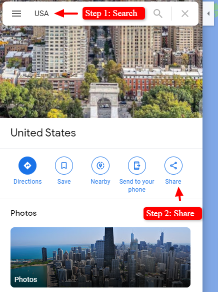
First, get a Google Map you’d like to embed.
- Go to Google Maps
- Search for the location you want to embed
- Click the Share link
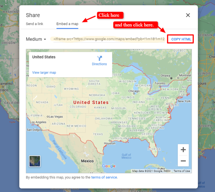
Get the Embed Code
Clicking the Share link opens a pop-up where you can get the Embed a map code.
Add the Code
Next, add the map’s embed code to your web page and wrap it with a containing div HTML element like this:
<div class="map-container">
  <iframe src="https://www.google.com/maps/embed?pb=!1m18!1m12!1m3!1d13004078.75648254!2d-104.6568059439823!3d37.275602428659404!2m3!1f0!2f0!3f0!3m2!1i1024!2i768!4f13.1!3m3!1m2!1s0x54eab584e432360b%3A0x1c3bb99243deb742!2sUnited%20States!5e0!3m2!1sen!2sus!4v1614377791913!5m2!1sen!2sus" width="600" height="450" style="border:0;" allowfullscreen="" loading="lazy"></iframe>
</div><!-- closing of div.map-container -->
Notice that what you copied from google is only an iframe that looked something like this:
<iframe src="[specific-location-url]" width="600" height="450" style="border:0;" allowfullscreen="" loading="lazy"></iframe>
We’ve taken it an extra step and wrapped it inside of a div, using opening and closing div tags, with the CSS class of map-container.
<div class="map-container">
    ...iframe embed code goes here...
</div>
Styling the Map
Last, but not least — you need to sprinkle on some CSS to style the map’s container and iframe. Add these styles to your website’s CSS stylesheet.
.map-container {
    overflow: hidden;
    padding-bottom: 56.25%; /* 16:9 aspect ratio */
    position: relative;
    height: 0;
}
.map-container iframe {
    position:absolute;
    left: 0;
    top: 0;
    height: 100%;
    width: 100%;
}
Here, the containing div acts as a viewport for the map. Specifying zero height and 56.25% padding-bottom gives the container a responsive aspect ratio of 16:9. Regardless of the width of the container — which is currently going to fill 100% of wherever it is on the screen — it will have a relative height that is 56.25% of how wide it is.
Inside, the iframe has been set to fill the space. It will always fill 100% of the container’s width and 100% of the container’s height, so just like the container div it will display with an aspect ratio of 16:9 — responsively resizing to fit your screen.
Try it Out
The embedded Google Map on your website should now be responsive. Test resizing your web browser to try it out.
0 Comments